I am addicted to digital archives.
This morning on a whim, I clicked on a link from U.T.’s Harry Ransom Center. I spent the next several hours absorbed in the facsimiles of the maps from the Kraus Collection, a private collection that spans the 16th-18th centuries.
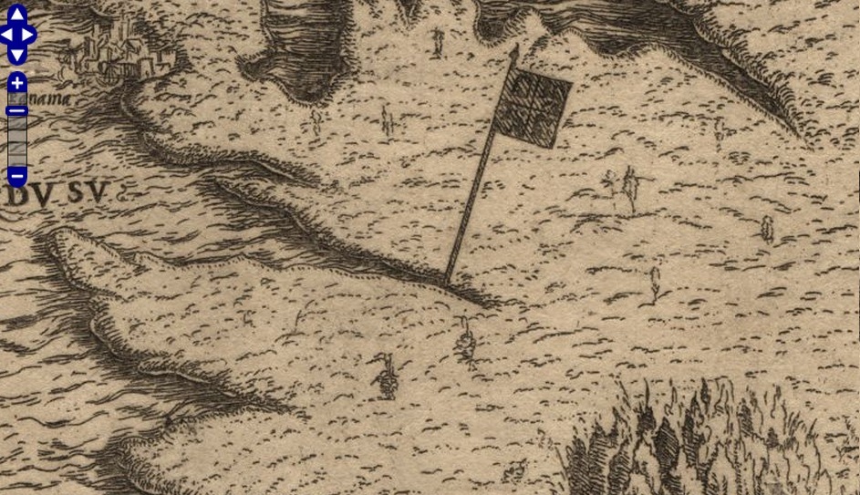
The earliest map, dated 1545, announces «Peru is the latest discovery in the New World.» It shows us an image of Peru: a flag, a forest (southeast corner), and Panama city (northwest corner.) I love how the map defines the space through action: Peru exists because a flag was planted on the shore. I love, too, this way of imagining space: if we don’t know what it looks like, there must be nothing there.
Peru didn’t stay vacant in the European imagination for long. Here, Peruvian maps over time:
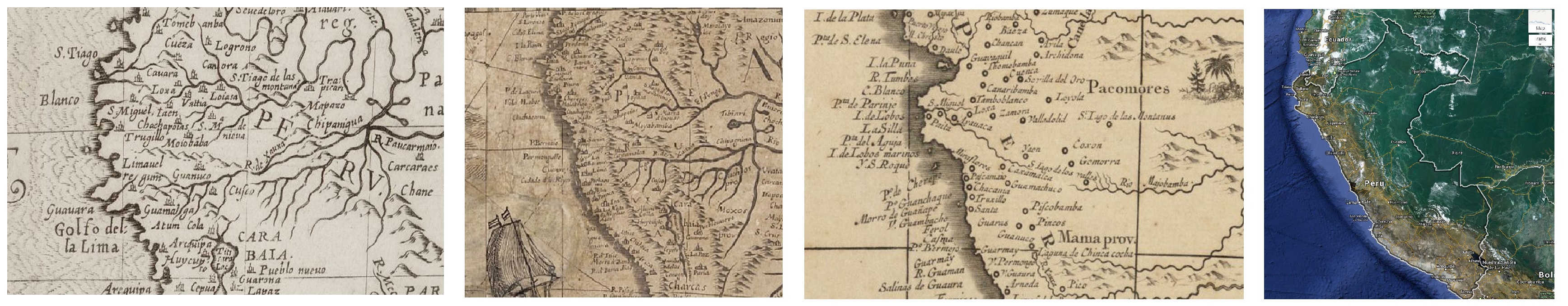
It’s neat to see how geography shifts across the maps (coasts, rivers, lakes) and how the landscape is populated with new cities. Interestingly, the maps don’t seem to become more accurate, at least according to Google standards.
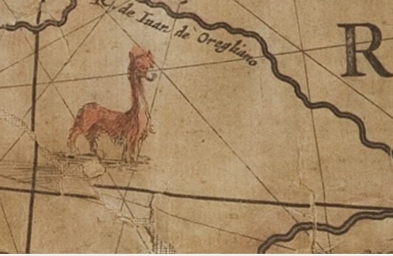
Also neat to see how, as the mapmakers fill in the empty spaces on the maps, they don’t seem to distinguish between cartographic details, images denoting human or animal populations, and fantastical images. For example:
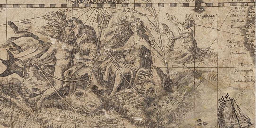
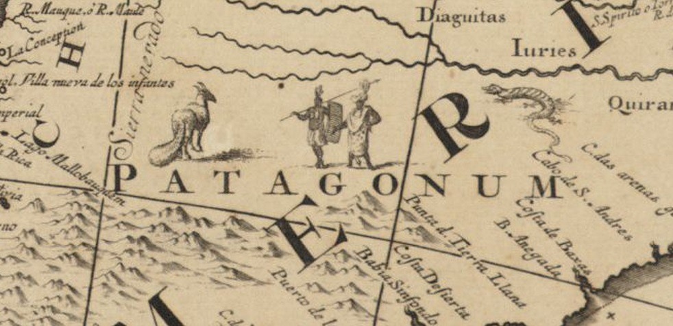
Of particular interest may be the way that indigenous people are incorporated into this complicated cartography. In this map of Patagonia from c1759, the people, like mythical creatures and exotic animals, are certainly not «people» in a European sense:
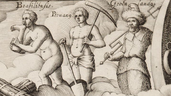
And in this illustration from 1600, indigenous people from across the Americas are arrayed on a cloud. The Peruvian carries a mining pick. The Brazilian seems to be eating someone’s leg:
These maps are delicate and (in some cases) too big to be moved, so they have only been seen by HRC staff and select researchers. It’s pretty exciting that we can now access some high-quality digital images online. Check out the collection, and some of the HRC’s other holdings, on their website.
Be prepared to spend all day.
Visitas: 0
